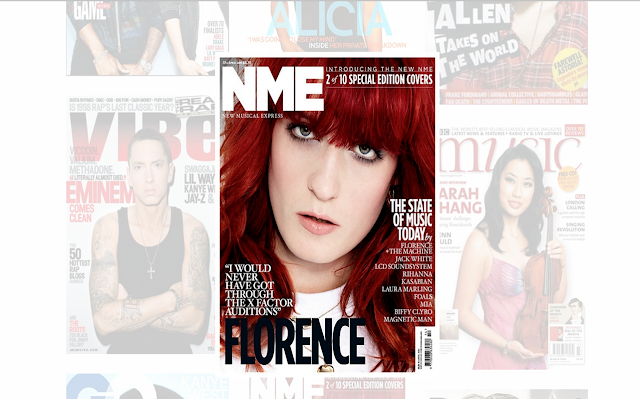
CLICK THE IMAGE BELOW TO VIEW A FULL EVALUATION
MEDIA A-LEVEL COURSEWORK
PUBLISHING
When considering methods of publishing my magazine I deeply
consider the genre and how many people from my Questionnaire read it too.
Referring to my results I can conclude that most of my voters read Hip-Hop. It’s
therefore a popular genre and should receive the correct publishing and
distribution.
Looking at a similar Hip-Hop magazine to mine I have carried
out some primary research on the magazine ‘XXL’. XXL release small versions of
articles which are featured in their magazine releases. I think this is a great
method as more people are using the internet to research and conduct
information. XXL doesn’t release an entire article or story as they still want
the consumer to make a purchase for the magazine. I agree with this and plan on
doing exactly the same. Instead, I’d release a copy of the contents page and
front cover on the website so that they can have a small insight of what each
article focuses on.
USE OF PHOTOSHOP
As you can see from the GIF above, there is a very small use of Photoshop needed, especially as i decided to keep the background the same colour. Although I did use Photoshop in order to add more contrast to the light area's of the photo and to crop unnecessary areas of the image . By doing this it allowed more important area's to be highlighted such as on the use of makeup which conforms to the Male Gaze Theory as my model is wanted to be presented as a beautiful young lady, The clothing to show how women can get away with baggy clothing which was popular in Hip-Hop and adds focus on the accessories such as the camo hat and gold jewelry.
CONTACT SHEET
Here is a selection of the images which i have taken. All of these images conform to my magazine genre, this is shown through technical codes such as the use of black and non-exposing clothing. The use of makeup also reminds the audience that female artists can subvert to the male gaze theory by wearing baggy and masculine clothing; But they can also be presented as 'classy' and 'sexy'.
This file has been uploaded with 'SlideOnline.com'
This file has been uploaded with 'SlideOnline.com'
CLOTHING PLAN
The Clothing Plan includes the different outfits which will be presented throughout my magazine. The clothing that is shown will be used on either my front cover, double paged spread or even my contents page. Whilst choosing my outfits I had to make sure that my outfits clearly conformed to my Magazine genre (Hip-Hop/R&B). Once again this is presented through technical codes (costume). I have also explained reasons why I have chosen each specific product.
FONTS
I have chosen various styles, thick and boldness of fonts in order to show examples of fonts which won't be used for my masthead.
These fonts are extremely familiar and well-known. For my magazine I wanted to create a different look, by not choosing any of these basic fonts.
However, my masthead font shall be 'bold'. Reasons being, it's more eye catching and stands out amongst the rest of the font used on my front cover.
My font will also be large, especially as it's at the centre top of the page. I want consumers and the audience to be familiar with my font so that they have some sort of attachment to my magazine and are more likely to make a purchase.
The font will be in bright red, to conform to my colour scheme.
MARKET RESEARCH
This presentation shows my extensive research into my chosen magazine genre. Two of the magazine companies chosen in this presentation are extremely similar to how i will market my magazine as well as the design of my magazine. Both of these magazines are known for a high use of red. The colour red is also highly associated with 'blood' and 'terror' and is well linked to the Hip-Hop genre and era. My magazine will therefore have a high use of red as it is then clear what kind of audience i am targeting ( those who listen or share an interest for the Hip-Hop and rap genre).
Both of these magazines have worked with Rap LEGENDS. This is clear because of the use of celebrity endorsement which is always used on every single issue released by these two companies. My model is also a rap artist and well known. This will be a good use of celebrity endorsement as my audience will feel a sense of 'safety' and 'reassurance' when purchasing and coming across my magazine as they're familiar with the artist. I will therefore be attracting my model's fans and many other potential customers (audiences).
MUSIC MAGAZINE CONVENTIONS
This post shows the typical conventions used in a music magazine.
Conventions are used in order to help the audience identify what magazine genre the magazine is.
I have also given examples of conventions used in different magazine genres in order to highlight the differences.
Conventions also help a magazine to therefore benefit financially as theyre more likely to have increased sales if they're targetting their target audience properly.
I have used 'Prezi' in order to present the handful amount of conventions.
MOOD BOARD
( Please Click the Image )
My Mood Board has been created using a site called 'gomoodboard.com'. I decided to use this website as its different, unique, quick and easy to use. It also allows my images to be presented in top quality. My Mood board consists of different music magazine genres. This helped me to decide which genre to choose for my own magazine. I can conclude that i have chosen Hip-Hop/R&B as my magazine genre as it's easy to identify and can be presented in various ways with the help of conventions and technical codes.
Subscribe to:
Comments (Atom)


